Source: Flickr_color-mood-chart_This Colour Mood chart may help you to cr…
Understand how Colour plays an important role in the art of visual storytelling. Learn how artists use colours to manipulate emotions, themes, and create depth.
A colourful world is quite beautiful, no? We can’t even imagine how dull a world without colours would look like. It is a fundamental element in visual arts as well as our life and serves as a medium for evoking emotions and telling stories.
The very science of colour theory has proved that artists who have a structured understanding of our colour work and are able to produce pieces which have depth in them. Once someone masters colour theory, they are able to effectively manipulate mood and motion, and create pieces which guide viewers through their creative visions.
Understanding Colour Theory
Let’s first understand- what is colour theory? This is important because even though we learn about the basics of colour in school, very few of us actually learn about the fundamentals of colour theory.
Colour theory is a framework, or a tool, used to help us understand how to use colours. It explains how we can mix, match, and contrast colours with one another, and how human beings will perceive it. It is important because it defines how viewers perceive and experience an artwork. It is crucial to understand colour theory if you want to create a brand identity or a very recognisable mark of your art and it also improves the readability of the artwork.
The study of colour theory involves learning about:
- The Colour Wheel: A circular diagram which is divided into different sections for different colours. Each colour is placed according to the relationship it has with the other colours. The wheel includes the primary colours (red, yellow, and blue), the secondary colours (purple, orange, and purple), and the tertiary colours (colours formed by mixing the primaries and secondaries together).
- Colour Harmony: Colour Harmony refers to the concept of combining colours together based on how appealing their combination will be. There are three very popular harmony schemes used according to the arrangement in the Colour Wheel. These involves combining colours which are placed opposite to each other (Complementary), are places adjacent to each other (Analogous), and which are three spaces away from each other (Triadic). Other than this, there are three more important schemes- using a single colour in different tints, shades, and tones (Monochromatic), choosing the colours next to the complementary colour (Split-complementary), and using colours which are at the corners of a rectangle placed on the wheel (Tetradic).
- Colour Temperature: There are two distinct colour temperatures- warm (expressed by colours like red, orange, and yellow) and cool (expressed by colours like blue, green, purples). Warm colours signify energy and passion, while the Cool colours represent calmness and serenity.
- Colour Value and Intensity: The lightness and darkness of a colour (its Tint and Shade respectively), and its saturation (its Tone) can be used to create contrast and focus in the art.
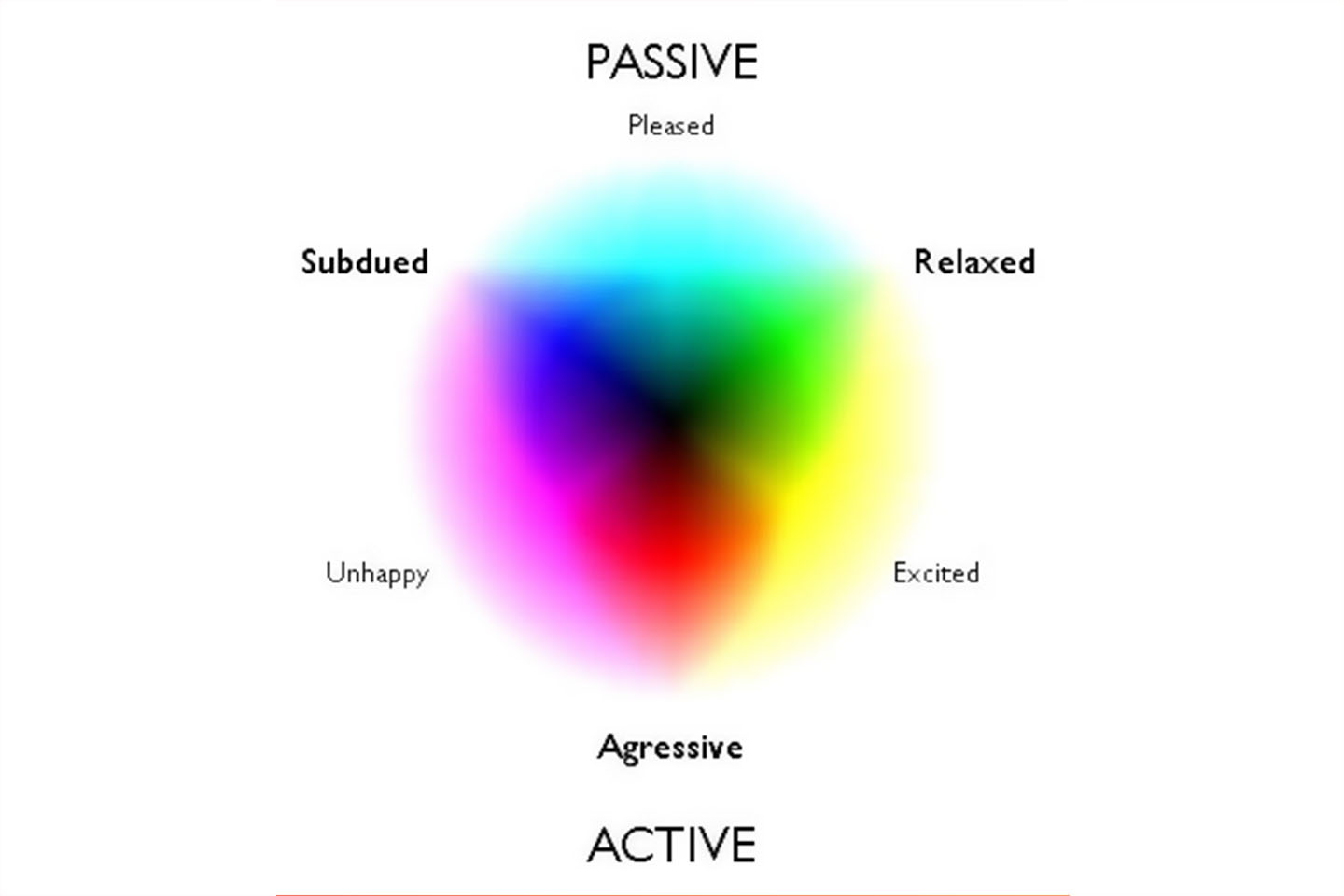
Evoking Emotions
The psychological impact of colours on the human psyche should not be underestimated. Colours are so much more than just visual treats and can help us instinctively understand what emotion the artwork wants to evoke when we look at it.
- Red: Red is a colour which can evoke strong emotions like passion, energy, love, and anger in the audience. It is used by artists when they want their artwork to look intense and dynamic. The painting The Scream by Edvard Munch has red in the background which shows how the person in the painting is worried and panicking.
- Blue: Blue is used two ways- light blues evoke feelings of calmness, while darker shades evoke sadness and introspection. Van Gogh’s Starry Night uses blues in different shades and tones to create a sense of peace and calm when viewers look upon it.
- Green: Green can also be used in two different ways according to what the artist wants- it can either be used to represent growth and nature, or can be used to evoke envy and sickness. The painting Synchronie en Vert (Synchrony in Green) by Paul Sérusier uses shades of green to represent harmony and balance.
- Purple: Purple is often used for representing royalty and luxury. In The Kiss by Gustav Klimt, purple is paired up with gold, silver, and platinum to flaunt wealth and power.
- Orange:A warm and energetic colour, Orange can express celebration as well as caution. It is used extensively in the painting Sailboats at Sunset by Ferdinand du Puigaudeau to evoke feelings of vitality and enthusiasm.
- Yellow: Yellow has been used for expressing joy and happiness in many pieces of art. Vincent Van Gogh’s Sunflowers is a beautiful painting which makes one feel pleasant and joyous when they look upon it.
- Black: Black is associated with elegance but also with mystery. Many paintings like Picasso’s Guernica uses the colour to show grief and death, and how terrible war can be.
- White:White is the opposite of Black- it represents purity and innocence in art. The Temptation of Christ by Ary Scheffer used white to clothe Jesus to denote feelings of purity and peace.
- Brown:Brown represents warmth and earthiness. Being the dominant colour of the earth, it is used for painting emotions like stability. The Gulf Stream by Winslow Homer has a brown boat in a sea of blue which shows how the boat is the stable and reliable spot while the surroundings are dangerous.
Storytelling
The right use of colour theory can also help an artist narrate a story. Almost a hundred years ago the cinema we knew to be black and white, transitioned into a world of colour. Ever since then, story tellers and full makers have used colour theory to create a more vibrant method of storytelling and now, colour palettes manipulate the audience’s moves and emotions very simply by just using the right colours.
- Colours can easily set the tone for the kind of atmosphere the storyteller wants. If they want to show a warm sunset, they can use golden hues, and if they want to take their audience to a rainy day, the cool and muted tones of the colour Blue will work wonders.
- Colours can grab attention when used the right way. For example, a bright colour in the midst of a neutral background will surely get more attention than the rest of the art.
- Many colours can be utilised for the symbolic meaning they have. Many brands do this as well:
- Coca-Cola has an iconic red colour branding which is used for evoking feelings of passion and excitement.
- Apple uses a minimalistic colour palette, which mostly includes white, to represent elegance and innovation.
- Blue is used by Facebook to show that they are trustworthy and reliable brand. This is achieved easily since Blue represents calmness and peace.
Creating Depth
Visual depth and dimension are also enhanced when colour theory is used properly.
- Contrast: Contrast in between the colours creates a sense of depth, depending on the way they are used. Contrasting warm and cool colours creates the illusion of space because this contrast shows the difference between light and shadow.
- Temperature: Warm colours tend to bring the art to the front while cool colours are very suitable to show the items in the background.
- Value and Intensity: The same is also done by lighter and darker shades of colours. Lighters shades bring the art forward while darker shades push them back.
All in all, colour theory is a very important component if someone wants to make it big in visual arts. It can help in the creation of a very vibrant and rich valid of tools which can enhance the overall quality of an artwork. As a dynamic aspect of artistic expression, colour theory keeps on evolving and shaping the world of visual arts.
Resources
Understanding Colour Theory
- Bruna. (2022, March 16). Color Theory 101: A Complete Color Guide (2024) • Colors Explained. Colors Explained. https://www.colorsexplained.com/color-theory/
- What’s colour theory? A complete introduction guide. (2023, November 28). UX Design Institute. https://www.uxdesigninstitute.com/blog/guide-to-colour-theory/#What_is_colour_theory_A_definition
Evoking Emotions
- https://www.facebook.com/BryanMullennix. (2024, February 24). The Power of Color: Unveiling Artist Secrets to Emotional Alchemy – Artistry Found. Artistry Found. https://artistryfound.com/the-power-of-color-how-artists-use-color-theory-to-invoke-emotions/#The_Psychological_Impact_of_Color
- Myers, L. (2023, April 28). Color Psychology in Art: How to Evoke Emotions and Set a Mood | LouiseM. LouiseM Visual Social Media. https://louisem.com/447168/color-psychology-art
Storytelling
- Sampson, R. (2017, August). The Power Of Colour In Film: Storytelling Through Chromatics. Film Inquiry. https://www.filminquiry.com/power-colour-storytelling/
- Hash Engage. (2023, August 3). Telling Stories with Colors: The Psychology of Color in Visual Storytelling. Hash Engage; Hash Engage. https://www.hashengage.com/blog/telling-stories-with-colors-the-psychology-of-color-in-visual-storytelling
Creating Depth
- Illustrators, A. (2021, August 20). Colour theory: How to create depth. Artists & Illustrators. https://www.artistsandillustrators.co.uk/how-to/art-theory/colour-theory-how-to-create-depth/